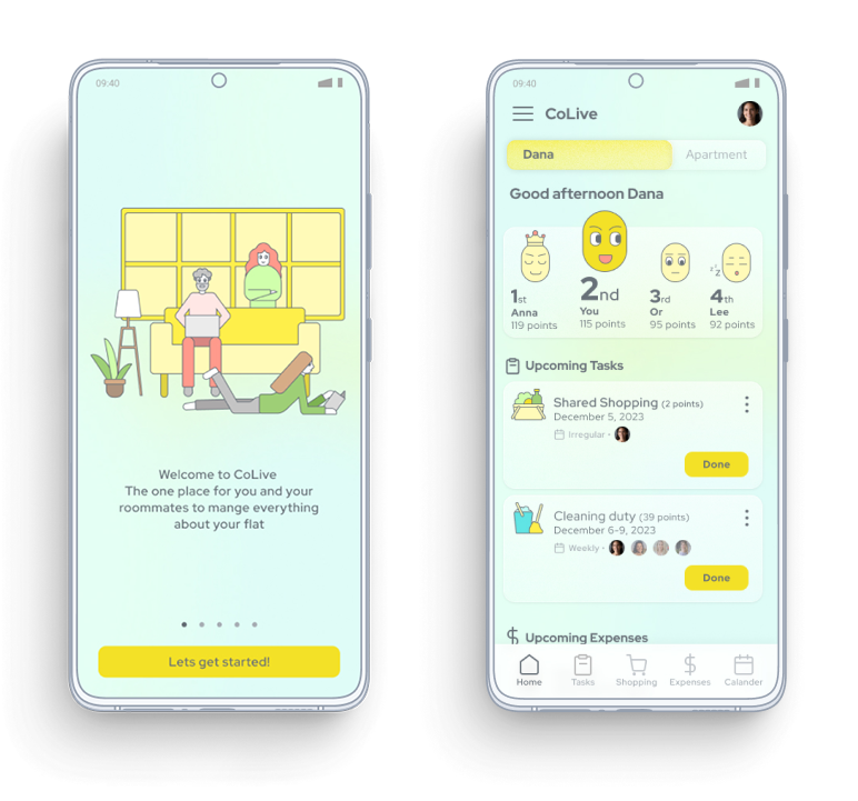
CoLive
An app for roommates designed to help manage every aspect of their shared living - from responsibilities to expenses.
Role: UX/UI Designer (individual project as part of course)
Tools: Figma, Miro, Adobe Illustrator
Deliverables: User research, wireframes, usability testing, design system, high-fidelity prototype.
The Problem
Roommates often struggle to keep track
of shared responsibilities, expenses, and
events — leading to confusion and frustration.
The Value
CoLive enables roommates to manage every
aspect of their apartment and adapt easily to
changing circumstances. The app provides a
clear overview of apartment responsibilities,
both individual and shared, and simplifies
expense tracking and distribution.
UFD

The Problem
Roommates often struggle to keep track of shared responsibilities, expenses, and events — leading to confusion and frustration.
The Value
CoLive enables roommates to manage every aspect of their apartment and adapt easily to changing circumstances. The app provides a clear overview of the apartment responsibilities, both individual shared, and simplifies expense tracking and distribution.
UFD
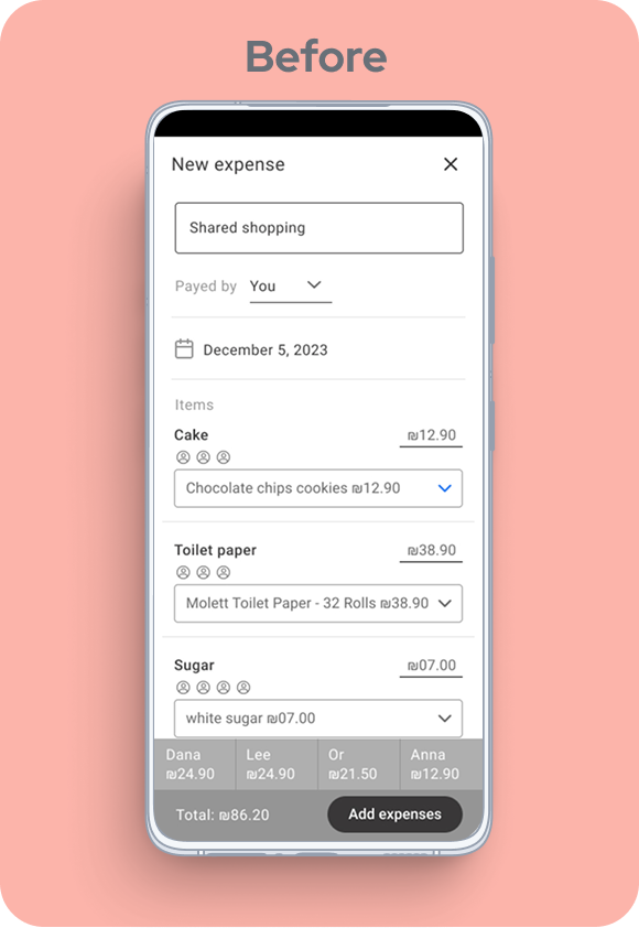
Usability Testing

Adding shared purchased
items to expenses
1
Users didn’t notice the option to add shared purchased items to expenses, as they didn’t perceive it as a button. The placement during the shopping process also confused them.

As a solution, I made a clear distinction between the shopping task and the expense tracking. After the user finishes shopping, a notification appears reminding them to add a new “shared shopping” expense.
Verifying scanned receipt results
2

Users didn’t understand what to do at this stage. They were unfamiliar with this type of verification process, and the placement under the “New expense” heading added to the confusion. Overall, the screen created cognitive overload.
As a solution, I removed unnecessary elements from the screen and simplified the verification process, breaking it into gradual steps to reduce cognitive load.

Wireframes


Design


Design System
Color Palette

Typography
Font: Red hat display

Icons

Glassmorphic Elements

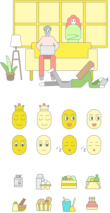
Illustrations & Illustrated Icons
All illustrations and custom icons were created by me specifically for this project.
This was the first project I built from scratch — from concept and research to high-fidelity UI design - and it taught me how to manage a complete UX process. Usability testing revealed issues I couldn’t anticipate, and iterating on feedback greatly improved the product.
If I had more time, I’d enhance the roommate rating system to make it more engaging. I would also run another usability test on the receipt verification flow, and explore adding in-app payments for a smoother shared-expense experience.